
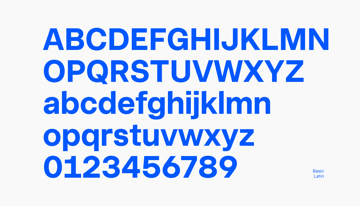
Innovator Grotesk is the debut typeface from Yep! Type Foundry, released in 2024. It’s a neo-grotesque, neutral yet distinctive, carefully crafted for a broad range of applications—from user interfaces to brand identity and outdoor design. It’s especially optimized for on-screen use.
At a glance
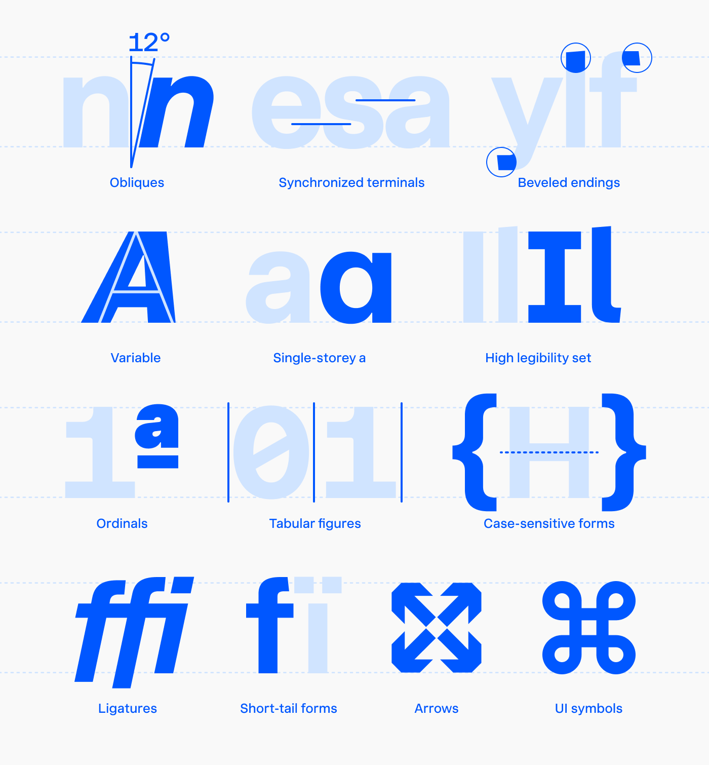
- 18 font styles: 9 weights with 9 corresponding obliques.
- Font weights range from Thin (100) to Black (900).
- Includes a single variable font encompassing all 18 styles.
- Obliques have a 12° slant angle.
- Lowercase letters are 75% as tall as uppercase ones.
- Supports over 250 languages that use the Latin script.
- Includes 3 stylistic sets and 15 character alternates.
- OpenType features include tabular figures, case-sensitive forms, ordinals, ligatures, and short-tail alternates.
- Comes with a set of UI icons.
Character and purpose
Innovator Grotesk leans toward a formal, contemporary, and technical vibe, with geometric, mechanical, and industrial qualities. It’s less suited for fun, historical, humanistic, organic, or natural designs. This makes it a great fit for IT companies, as well as brands in production, design, construction, and similar industries.
UI DESIGN
Innovator Grotesk shines in user interfaces for web, mobile, and desktop apps. With vertical metrics that ensure text labels appear vertically centered on buttons and alongside icons, a tall x-height (75% of cap height), extra optimization for the pixel grid, and precise hinting, this typeface is the perfect on-screen workhorse.
BRAND IDENTITY
It’s neutral enough for plain text, yet it offers subtle, distinct details that make it both recognizable and memorable—key qualities for strong branding.
WAYFINDING
Due to its relatively close apertures, I wouldn’t recommend it for designs with strict requirements for character distinctiveness, like road signage. However, thanks to the high-legibility set, I’d definitely give it a shot in wayfinding systems and designs where the requirements aren’t as strict.
Recommended font sizes
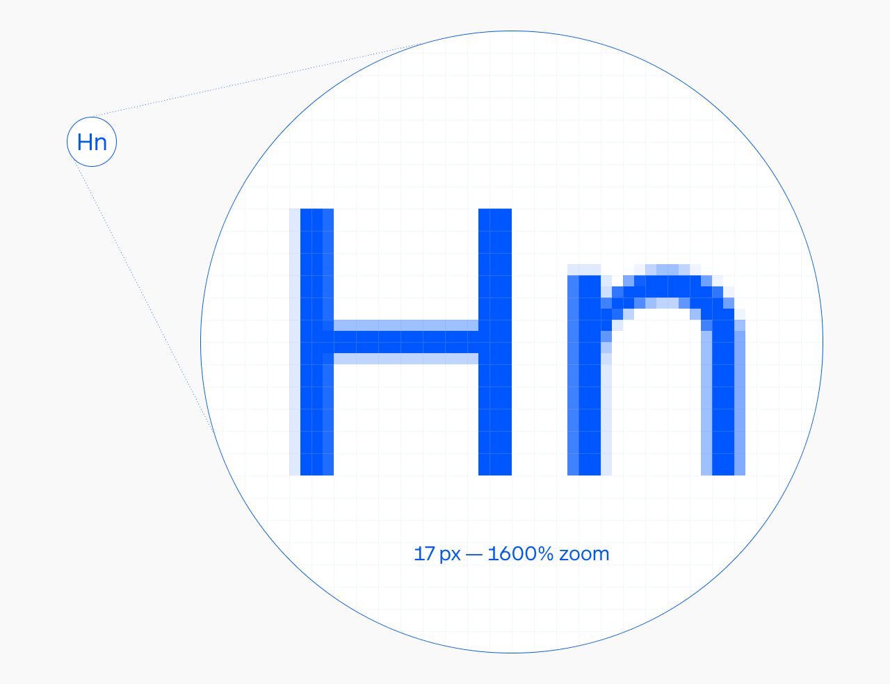
Innovator Grotesk is optimized for 17 px: at that size, capital letter heights land exactly on the pixel grid—no blurry edges, clean tops and bottoms.
To keep that sharpness at other sizes, use these font-size/line-height pairs:
| Font size, px | Line height, px |
|---|---|
| 8.5 | 10 |
| 9.9 | 11 |
| 11.3 | 14 |
| 12.74 | 15 |
| 14.15 | 16 |
| 17 | 20 |
| 18.4 | 21 |
| 19.8 | 22 |
| 21.2 | 23 |
| 22.5 | 24 |
| 24 | 25 |
| 25.46 | 26 |
| 26.9 | 29 |
| 28.3 | 30 |
| 29.7 | 31 |
| 31.1 | 32 |
| 32.5 | 33 |
| 34 | 34 |
If you need more breathing room, increase line-height by any even number (2, 4, 6). This keeps equal space above cap height and below baseline, which makes text look vertically centered—handy for button labels and icon alignment in UI.
If you prefer rems, keep 17 px as your root font size.
The decimal font sizes might look odd, but they’re a mathematical proportion that helps the rasterization algorithm do its job. Text lines come out sharper. I’ve tested this across all major browsers and operating systems—computers don’t mind 14.15 vs 14, only humans do.
Font formats
By default, choose the variable font over static font files. For desktop use, go with InnovatorGrotesk-VF.ttf. For web development, the best option is InnovatorGrotesk-VF.woff2 (refer to the relevant section below).
If you’re using static font files, prefer ‘ttf’ for Windows and ‘otf’ for Mac.
Web development
Important note: Store font files securely on your server or CDN, ensuring they’re not freely accessible. For example, avoid uploading them to GitHub.
@font-face {
  font-family: "Innovator Grotesk";
  font-display: swap;
  src: url('https://your-cdn.dev/InnovatorGrotesk-VF.woff2') format('woff2');
  font-weight: 100 900;
  font-style: normal;
}
When using the variable version of Innovator Grotesk, it’s better to adjust the font’s weight and slant angle using the font-variation-settings property rather than font-weight or font-style.
body {
  text-rendering: geometricPrecision;
  -webkit-font-smoothing: antialiased;
  font-variation-settings: "wght" 400, "ital" 0;
}
You can specify any value between 100 and 900 for the weight axis and between 0 and 1 for the italic axis. Here are a few examples:
font-variation-settings: "wght" 700, "ital" 1; /* Bold Italic */
font-variation-settings: "wght" 100, "ital" 0.5; /* Thin and half-slanted */
Additionally, I recommend setting the text-rendering property to geometricPrecision and -webkit-font-smoothing to antialiased. This configuration enhances text rendering quality, making it look sharper and more precise.
body {
  text-rendering: geometricPrecision;
  -webkit-font-smoothing: antialiased;
  /* ... */
}
Fallback font metrics
To minimize layout shift while the font loads, define a tuned Arial fallback using CSS font metric overrides. This keeps line lengths and block heights nearly identical between fallback and custom font, making the swap imperceptible:
@font-face {
  font-family: 'Innovator Grotesk Fallback';
  src: local('Arial');
  ascent-override: 92%;
  descent-override: 23.8%;
  line-gap-override: 0%;
  size-adjust: 103.5%;
}
body {
  font-family: 'Innovator Grotesk', 'Innovator Grotesk Fallback', sans-serif;
}
For best results, pair this with a preload hint—the fallback metrics handle slow connections, preload eliminates the swap on fast ones:
<link rel="preload"
  href="https://your-cdn.dev/InnovatorGrotesk-VF.woff2"
  as="font" type="font/woff2" crossorigin>
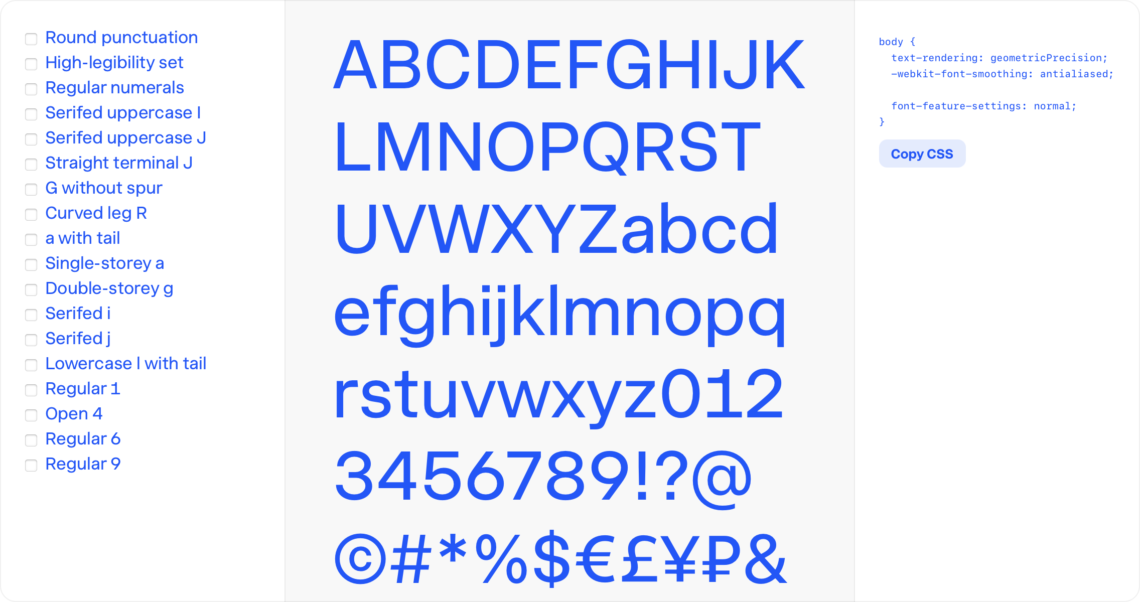
Stylistic sets and character variants
Innovator Grotesk offers 3 stylistic sets and 15 character variants, allowing you to customize the typeface’s look and feel.
Explore more about these alternates in the Update: Innovator Grotesk v1.1.
Stylistic sets:
- Round punctuation
- High-legibility set
- Regular numerals
Character variants:
- Serifed uppercase I
- Serifed J
- Straight terminal J
- G without a spur
- Curved leg R
- a with a tail
- Single-storey a
- Double-storey g
- Serifed i
- Serifed j
- Lowercase l with a tail
- Regular 1
- Open 4
- Regular 6
- Regular 9
 You can also experiment with all possible combinations—even if you don’t own the font—using the Innovator Grotesk feature guide.
For a full reference of every stylistic set and character variant added since the original release, including before/after examples of ss01, ss03, and all fifteen character variants, see the Innovator Grotesk v1.1 update notes.
If a project calls for a more technical, industrial register on the same personality scale, consider Unifora.