
This day comes to every product designer: you set your first concept designs to lovely Inter—everyone’s all-time favorite UI font—and then someone—your customer, your boss, or even some part of your own soul—says “hey, big fan of it, but it’s everywhere, can we maybe try something else?”
Let me give you a hand here. In this article I’ll share just two simple criteria that help you pick a font that’s a delight to work with. As a typography nerd and an actual product designer with more than a decade in the field, I keep a collection of 60+ neo-grotesks (zero Helveticas), and fewer than one in three match these two criteria. So “just pick a clean sans-serif” isn’t enough—most of them will quietly cost you alignment work. And here’s how to spot the ones that won’t.
TL;DR, two things make a UI font easy to work with:
- Cap-centered vertical metrics—the space above the cap height equals the space below the baseline. Result: labels center optically on buttons and align with icons, and you can use a single padding token instead of hand-tuned CSS.
- Tall x-height—lowercase letters reach 70–75% of cap height. Result: the word nearly fills its box, so it looks evenly centered.
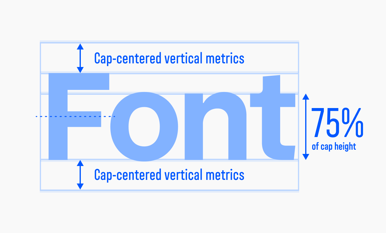
Cap-centering positions the word. A tall x-height is what makes that position look right. They’re not two separate rules—the second is what makes the first work.
The ideal UI font has cap-centered vertical metrics
Cap-centered vertical metrics mean the space inside the font’s bounding box above the cap height equals the space below the baseline. You’ll also see this called “equal vertical metrics,” which is shorthand for the same thing.
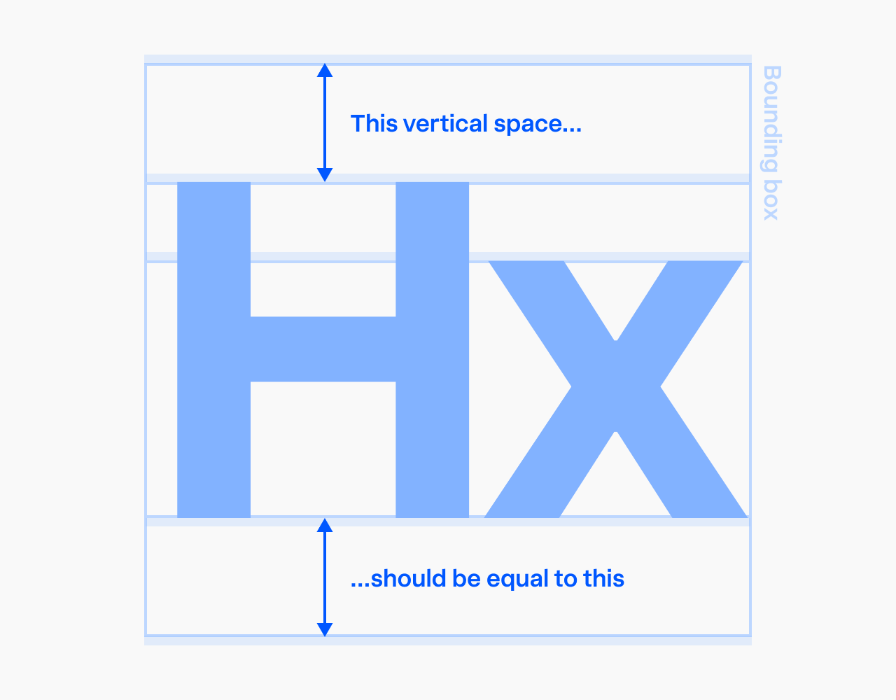
Cap-centered vertical metrics ensure labels sit optically centered inside their bounding box and, as a result, on buttons and other UI controls. Besides that, the label aligns precisely with any icon sitting next to it.
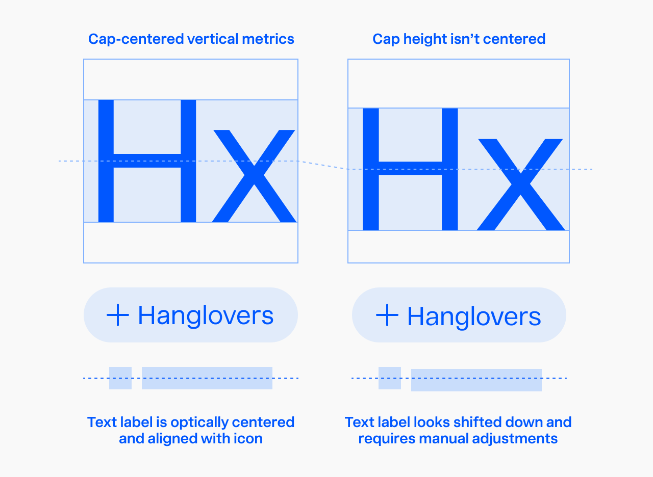
The second effect is that in your design system you can use a single token for both vertical paddings, which makes it much easier to maintain. Without cap-centered metrics, you’d need manual CSS tweaks to optically center each label—hard to support down the line.
Good—one rule, every size:
.button { padding: var(--space-v) var(--space-h); } /* holds at any font size */
Bad—the fix has to be redone per size:
.button      { padding: 13px 16px 11px; } /* 16px text */
.button--sm  { padding: 10px 12px  8px; } /* 14px text — different nudge */
.button--lg  { padding: 17px 20px 15px; } /* 20px text — different again */
How to check in Figma that the typeface has cap-centered vertical metrics
Type any word (I prefer the made-up word “Hanglovers”—it packs in all the key characters that help you assess the typeface vibe) and set the font size to 1000 pixels; you need it large. Zoom in to the capital “H” and start decreasing the line height of the text object. Watch the text box shrink onto the letters: if its top edge lands on the top of the “H” and its bottom edge lands on the baseline at the same moment, the font has cap-centered vertical metrics. If the two edges don’t meet the letter together, put the font aside—it’ll probably be a great choice for print, but not for screens.
Fonts’ vertical metrics and the text-box-trim CSS property
One day—soon, I hope—the cap-centered metrics requirement will be obsolete. The CSS properties text-box-trim and text-box-edge (originally proposed as leading-trim and text-edge) solve the problem of off-center metrics by letting you trim the font’s em box to the cap height on top and the baseline on bottom.
.font-with-nonequal-vertical-metrics {
  text-box: trim-both cap alphabetic;
}
cap means cap height, alphabetic means baseline. Other values include ex (x-height), text (font’s ascent/descent), and auto. So if you believe a label should be aligned by lowercase height instead, you’d write:
.font-with-nonequal-vertical-metrics {
  text-box: trim-both ex alphabetic;
}
The caveat: as of mid-2026 they aren’t widely supported yet. Global usage on caniuse is about 79%—Chrome, Edge, Safari, and iOS Safari support them; Firefox doesn’t, which keeps them from Baseline. So until support is comprehensive, my recommendation is to stick with fonts that already have cap-centered metrics.
But this only ever fixes half the problem. text-box-trim can correct a font’s metrics; it can’t touch its x-height. And a tall x-height is the other half of what makes a label look centered.
The ideal UI font has tall x-height
x-Height is the height of the lowercase letters in a typeface—their main body, without ascenders and descenders. “Tall” means at least 70%, ideally 75% of the cap height. 75% is the gold standard for interface typefaces: Inter, San Francisco, and Innovator Grotesk all sit at 75%.
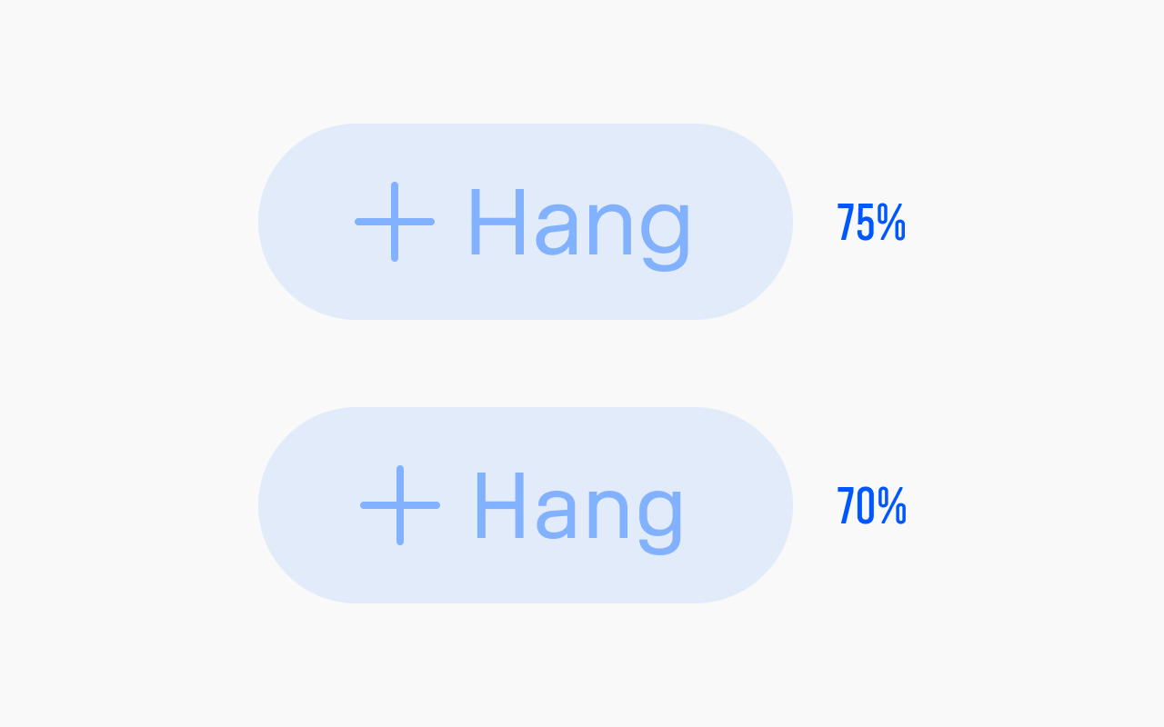
When we center a label by its cap height, we’re treating the word as a solid brick as tall as a capital letter. But a word isn’t a brick—it’s one tall capital and a row of shorter lowercase letters. A few of them, like g or y, dip below the baseline, but there are too few per word to count—the eye treats the baseline as the floor, the same reason type sits on a baseline and not on its descenders. The taller the lowercase, the closer the word comes to reading as a solid brick.
At 75% the word still isn’t a perfect brick, but it reads as almost one—close enough that centering the capital optically centers the whole word with it. And the difference between uppercase and lowercase is still big enough for the word to look normal.
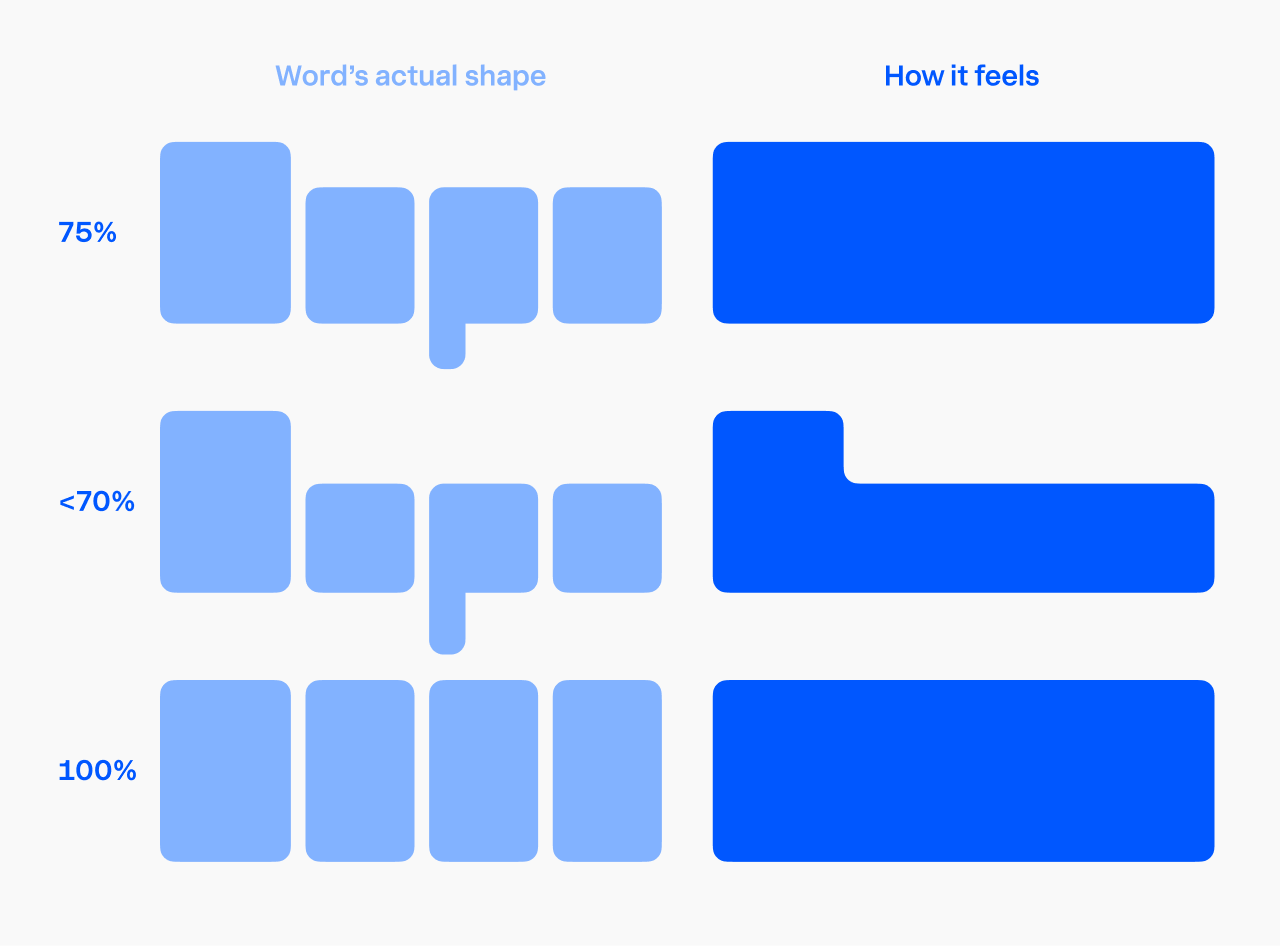
Set the x-height below 70% and there’s too much empty space above the lowercase. The eye reads the word as sitting low, and no cap-centering can fix that. Set it to 100% and you get the perfect brick—but that’s essentially a unicase look: the word loses its up-and-down rhythm, its recognizable pattern disappears, and it starts looking unusual and pulling too much of your attention.
Wait… shouldn’t text be aligned by x-height rather than by cap height?
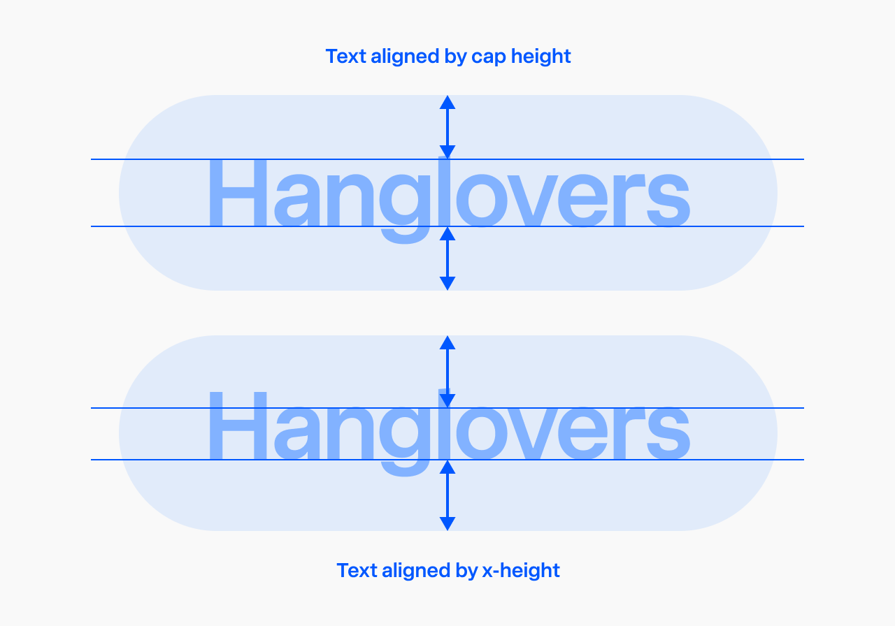
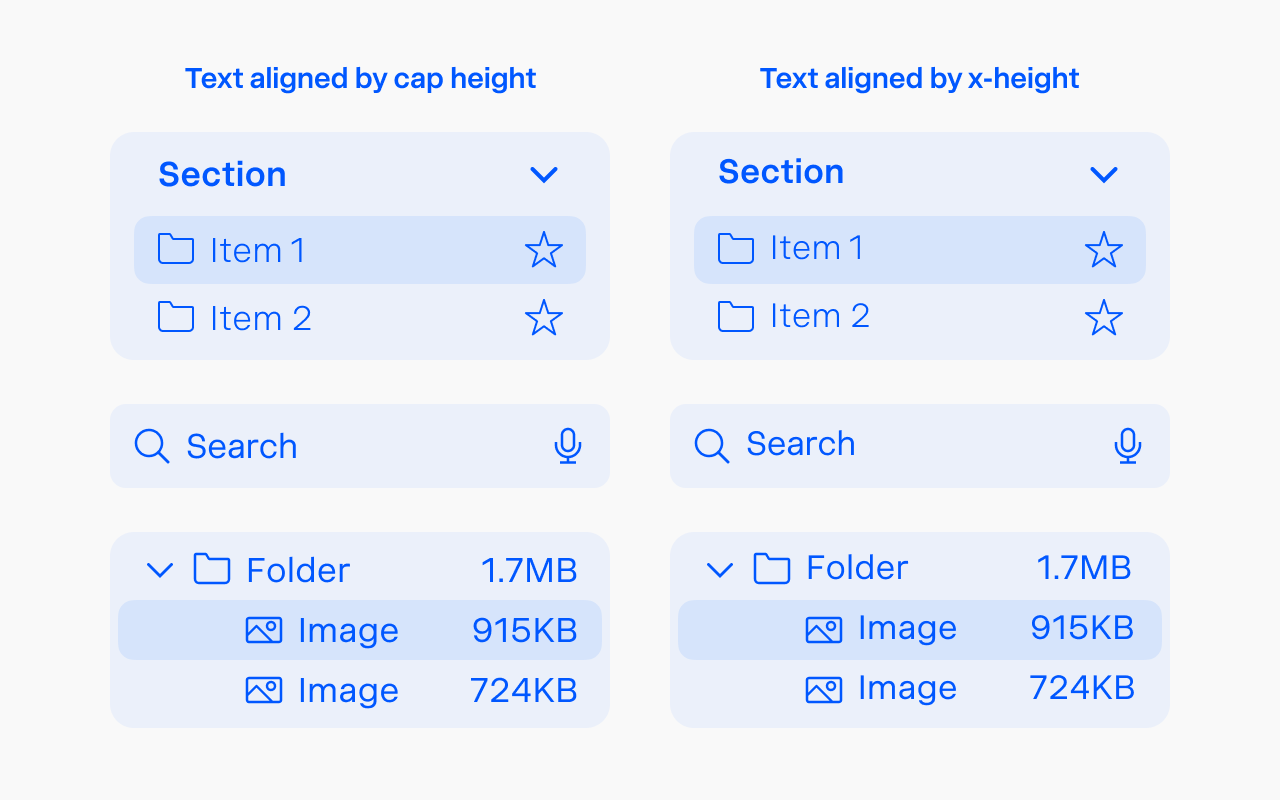
Fair question—in an average word lowercase always outnumbers the capital. But the eye tends to anchor on the first letter to judge where the word sits, and in a UI label that first letter is usually a capital. Align by lowercase instead and the capital pokes out the top, so the word looks unbalanced. (An all-lowercase label is the exception—no capital to anchor on—but in interfaces most labels start with a capital anyway.)
So you anchor on the capital—and here’s where the tall x-height pays off. Because the lowercase reaches most of the way up, its mass sits right below the capital instead of sagging away from it. Cap height sets the anchor; a tall x-height brings the rest of the word up to meet it. That’s why you need both.
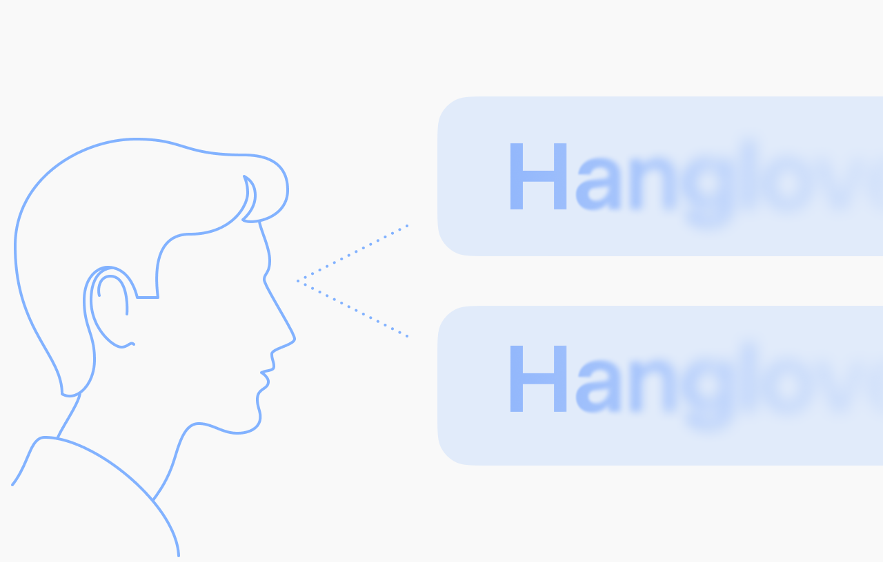
And when there’s an icon to the left of the text, it reinforces the effect—the eye compares the icon with the first letter, not with the whole mass of the word.
10 Inter and San Francisco alternatives for UI
Every typeface below is drawn so the cap height sits in the optical vertical center, so I didn’t repeat that in the list. The first two rows are the fonts you already know—Inter and San Francisco, your 75% reference points; the ten under them are the alternatives.
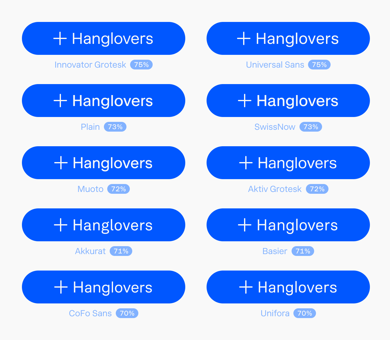
| Typeface | Foundry | x-height |
|---|---|---|
| Inter | Rasmus Andersson | 75% |
| San Francisco | Apple | 75% |
| Innovator Grotesk | Yep! Type Foundry | 75% |
| Universal Sans | Family Type | 75% |
| Plain | Optimo | 73% |
| SwissNow | Newglyph | 73% |
| Muoto | 205TF | 72% |
| Aktiv Grotesk | Dalton Maag | 72% |
| Akkurat | Lineto | 71% |
| Basier | atipo foundry | 71% |
| CoFo Sans | Contrast Foundry | 70% |
| Unifora | Yep! Type Foundry | 70% |
FAQ
What’s a good alternative to Inter? Any font that matches Inter on the two things that make it work for UI: cap-centered vertical metrics and a tall x-height (around 75%). Innovator Grotesk and Universal Sans sit at 75% like Inter; Plain and SwissNow are close at 73%. All ten fonts in the table above qualify.
What x-height is best for a UI font? About 75% of the cap height. That’s tall enough for the word to read as an even block and center itself in a button, but not so tall that uppercase and lowercase stop looking different. Below 70% the text starts to look like it’s sitting low; at 100% it turns into a unicase slab that’s hard to read.
Why won’t my button text center vertically? Usually the font’s vertical metrics: if its cap height isn’t centered in the bounding box, the label sits low and no amount of padding fixes it cleanly. Pick a font with cap-centered metrics, or, on browsers that support it, trim the box with text-box-trim.