
Retalics are reversed italics. If italic characters slant to the right, retalic ones look mirrored—slanted to the left. Another popular term is backslant, or backslanted typeface.
I prefer the “retalic” term and I want it to become a standard, because it’s short, it has a connection with its twinned italic, and “re” does all the work of explaining their reversed, backward, mirrored nature. This is why in Unifora—a uniwidth type family with an extended slant axis of 36° in total—I use it, e.g. Unifora Thin Retalic.
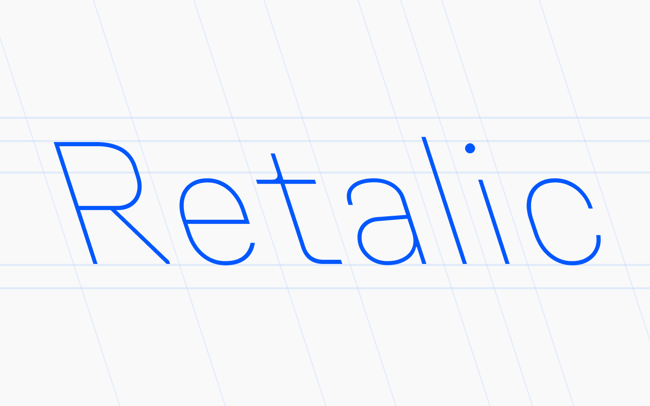
What makes retalics special
To understand what to use retalic fonts for, let’s first sort out what visual qualities they carry.
First, compared to other styles, retalics stand out the most. If we put upright, italic, and retalic on a scale of eye-catching-ness, upright would be zero—our eyes see it all the time. Italic would sit at 2, because it’s like a slight change in tone of voice. And retalic wouldn’t be 4, as you might expect—I’d put it at 8. It leans against the direction we read, so it really grabs attention and disrupts our perception. Since that’s a lot of power, it’s better to use it with care.
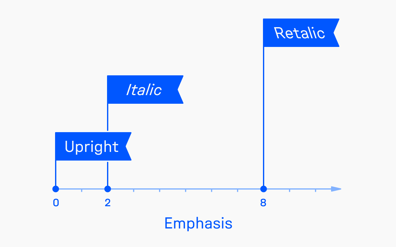
Second, retalics carry some vibes of being in opposition, even a bit of controversy. Since retalics look like mirrored italics, they can be perceived as “wherever everyone goes, I go the opposite way!”
And finally, thanks to cartoons, retalics are naturally associated with speed, sports, and movement.
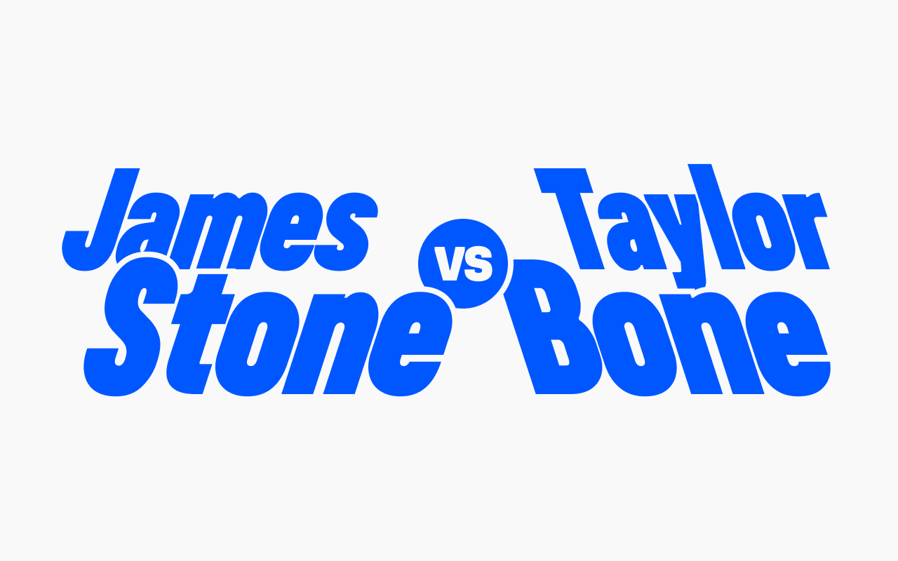
How to use retalic fonts in branding
Think brand identity for companies and products that revolutionize their field. If, citing Steve Jobs, the matter is about “the round pegs in the square holes,” there’s a good chance retalics can elevate this idea.
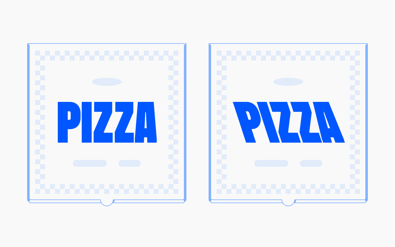
To demonstrate it, let’s take a look at the imaginary branding elements of a pizzeria brand. To make it easier to perceive, let’s use the same colors and the same composition—the only difference is the typeface: upright on the left, retalic on the right.
Notice how the pizza box set in retalic communicates a degree of protest. I’d guess this pizzeria is redefining pizza traditions—maybe even challenging them outright. Or they just deliver it fast.
Another made-up example: let’s imagine a bank brand and compare two print ads that could plausibly exist. Looking at the ad on the right, I’d assume this bank bets on speed of service and innovation to set itself apart from competitors. Probably their clients don’t need to visit branches at all—they can do everything online.
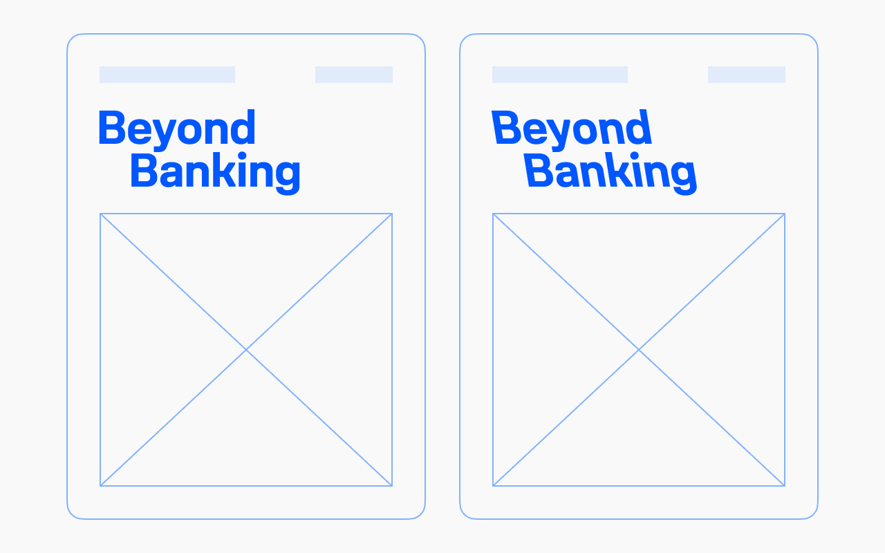
In all these examples, I intentionally keep the details and visuals generic—that helps you focus on the effect of the type change alone.
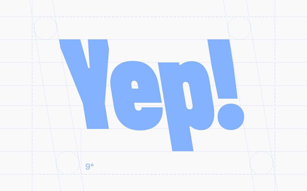
And finally, one real-world example: yours truly, Yep! Type Foundry. Because our license rewrites the rules, the foundry logo (at least the 2026 version) is set in retalic to communicate that idea.
How to use retalic fonts in graphic design
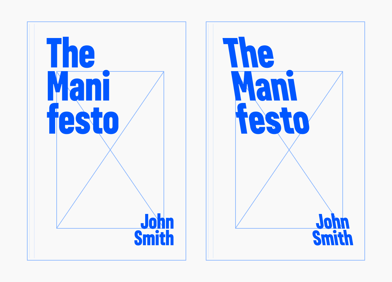
Let’s continue comparing two visuals to see how retalics change the same layout. Imagine two book covers with a vague title, like “The Manifesto.” Same effect here: the cover on the right makes me think this book’s content disrupts the status quo, or holds an idea that refuses to sit in the middle. Whatever the book’s genre.
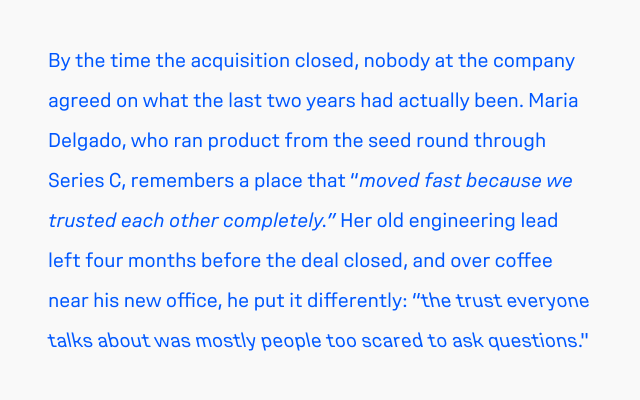
The same opposition works inside running text, not just on a cover—retalic and italic can stand for two voices that don’t agree: thesis and antithesis, point and counterpoint, myth and fact.
Picture a magazine profile built around two sources who remember the same events differently. The product lead’s on-record quote runs in italic; her old engineering lead gets the contradicting one in retalic. The disagreement registers before the reader finishes the sentence.
How to use retalic fonts in user interface design
In data graphics, retalics and italics can be used as an opposing-pair contrast: before and after, gains and losses, positive and negative. Picture a profit and loss report, a stock or crypto watchlist, or a trading calendar where positive values are set in italic and negative values in retalic—the opposite lean for the opposite sign.

This is especially useful for people with red-green color blindness. Fintech apps typically lean on a red-and-green scheme to mark gains and losses, and retalic carries that same signal on a second channel that doesn’t depend on color at all.
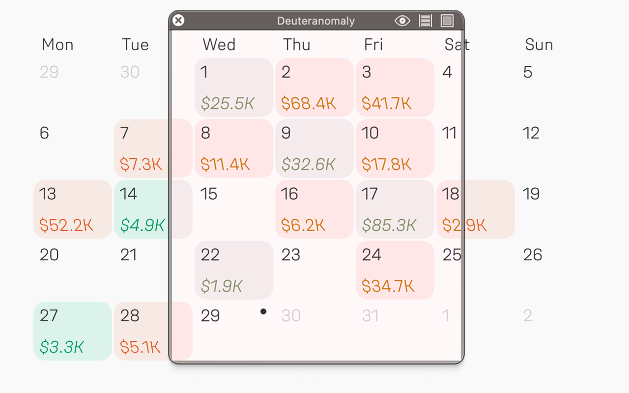
One thing to watch is size—the lean gets harder to read as the type gets smaller, so give it enough room to register.
How to use retalic fonts in kinetic typography
In a variable font, retalic effectively doubles the reach of the Slant axis—instead of stopping at upright, one axis can run continuously from italic through upright to retalic, which opens new expressive possibilities in motion.
I’ll leave exploring those possibilities to you, but here’s one practical tip: whenever you need to skew text, use the font’s built-in Slant axis instead of the default skew distortion in Cavalry or After Effects. For horizontal skew, use Slant as is. For vertical skew, combine Slant with rotation, setting both to the same angle.
When not to use retalic fonts
I’d definitely avoid setting long text in full 18° retalic—that’s a challenge for any reader (unless that’s your goal). A smaller slant, say around 4°, might work when you really need to add a controversial flavor to a page or two, but again, use it with care. Drawing them isn’t free either: retalic masters need their own punctuation, which is a whole side-quest I wrote about separately.
I also wouldn’t reach for retalics for brands and products meant to signal a commitment to tradition, or the comfort of the good old ways. A retalic’s nature is to rebel, so it won’t fit.
And finally, if your brand is delicate, if your voice is a whisper woven out of hints and semitones, set retalic fonts aside. I’d say they’re too loud and blunt to carry that many shades of grey.
* * *
Retalic fonts are still a rare beast, and their prime is only coming. We’re barely scratching the surface, and there’s plenty left to learn about how and when to use them. But that’s what makes this exciting—some pioneers (maybe it’s you?) may invent a new visual style, or find a use that isn’t listed here. We’ll see.