
On April 12, 2025, I tweeted: “Designing a uniwidth typeface family is such a challenge, I don’t think I’ll take on another one anytime soon.” That was half a joke.
In this article I share a few things I learned—and the design decisions I made—while designing uniwidth typeface Unifora, my second release for Yep! Type Foundry. For font lovers, it might lift the veil on the design process and answer why Unifora looks the way it does. For type designers, it might help you make an educated decision before starting a uniwidth font of your own. And if you never plan to draw a letter yourself, it’s a peek at a problem hiding inside fonts you use.
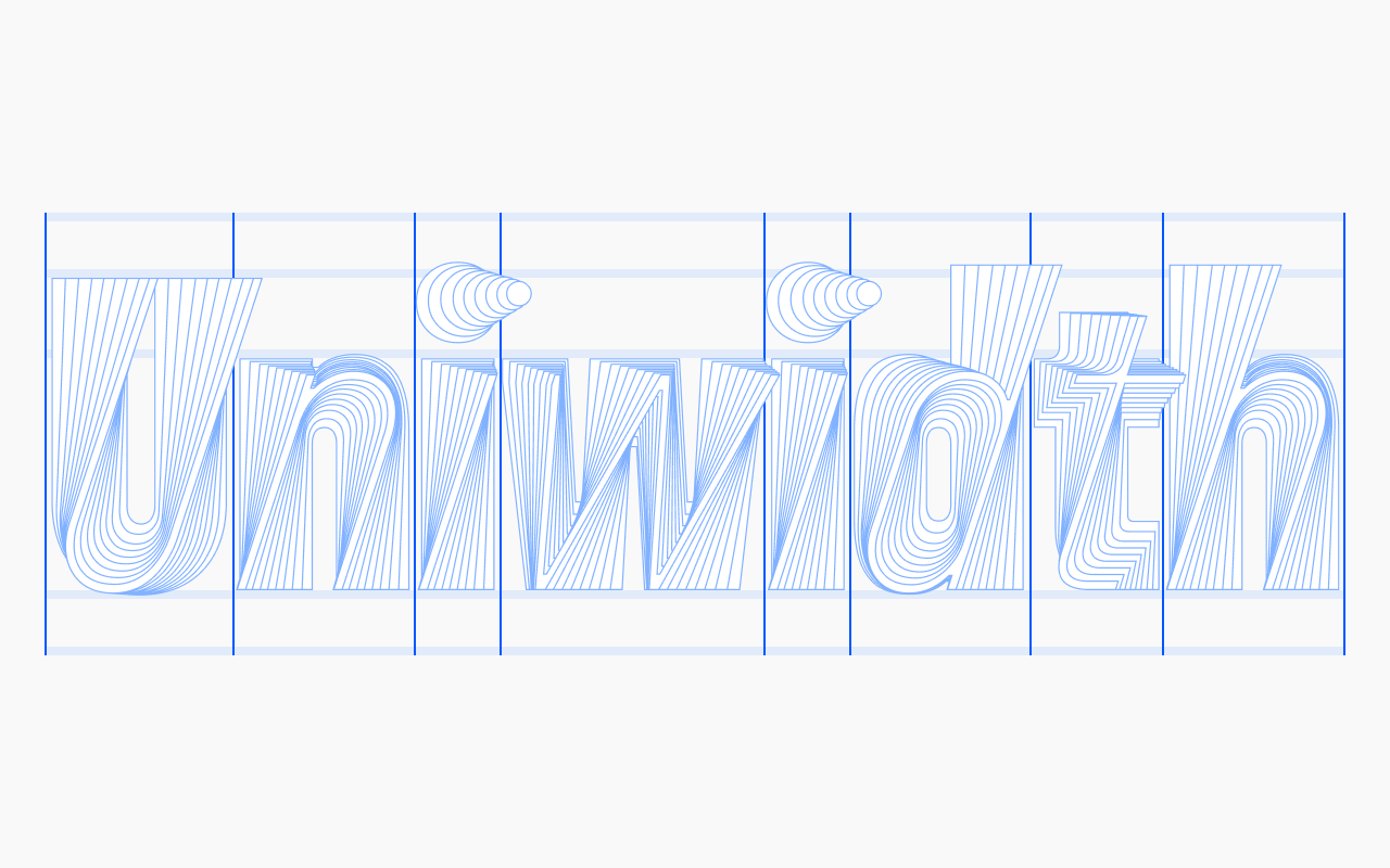
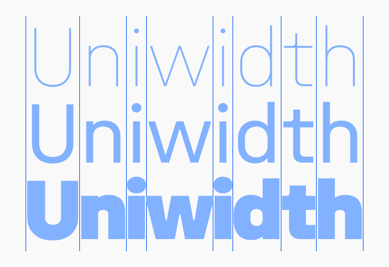
Uniwidth is a term coined by Hrant Papazian. You may see it called fixed-offset, equal-width, multiplexed, or duplexed. Unlike a monospaced font, where every character shares the same width—even glyphs as different as I and W—in a uniwidth font that rule applies only within a single glyph. So I and W have different widths, but every I—from Thin to Black, from Italic to Retalic—shares the same width.
For font users, the practical effect is that text doesn’t reflow when you make it bold, italic, or even bold italic—you get the idea. For type designers, it’s a captivating challenge: a mountain that’s exciting to climb.
Spacing on Thin and Black is quirky
It was impossible—which is why I had to try. In a uniwidth font, text set in Thin will always look loose, while text set in Black will always run tighter than you’d want. That is why some uniwidth families ship only a Light-to-Bold range, with nothing lighter or bolder: some designers choose not to fight windmills.
With Unifora, I decided that since it has a straightforward, technically drawn personality, it could go the full mile and offer the complete range from Thin to Black—even if strict typographers find the spacing at the extremes of the weight range quirky. Unifora, if it were a person, would say: “Yes it is, so what? I’m fine being this way.”
And fixing it is easier than easy. Just loosen Black a touch and tighten Thin a touch—with the letter-spacing setting in Figma or Illustrator, or the letter-spacing property in CSS.
The I and i determine the spacing
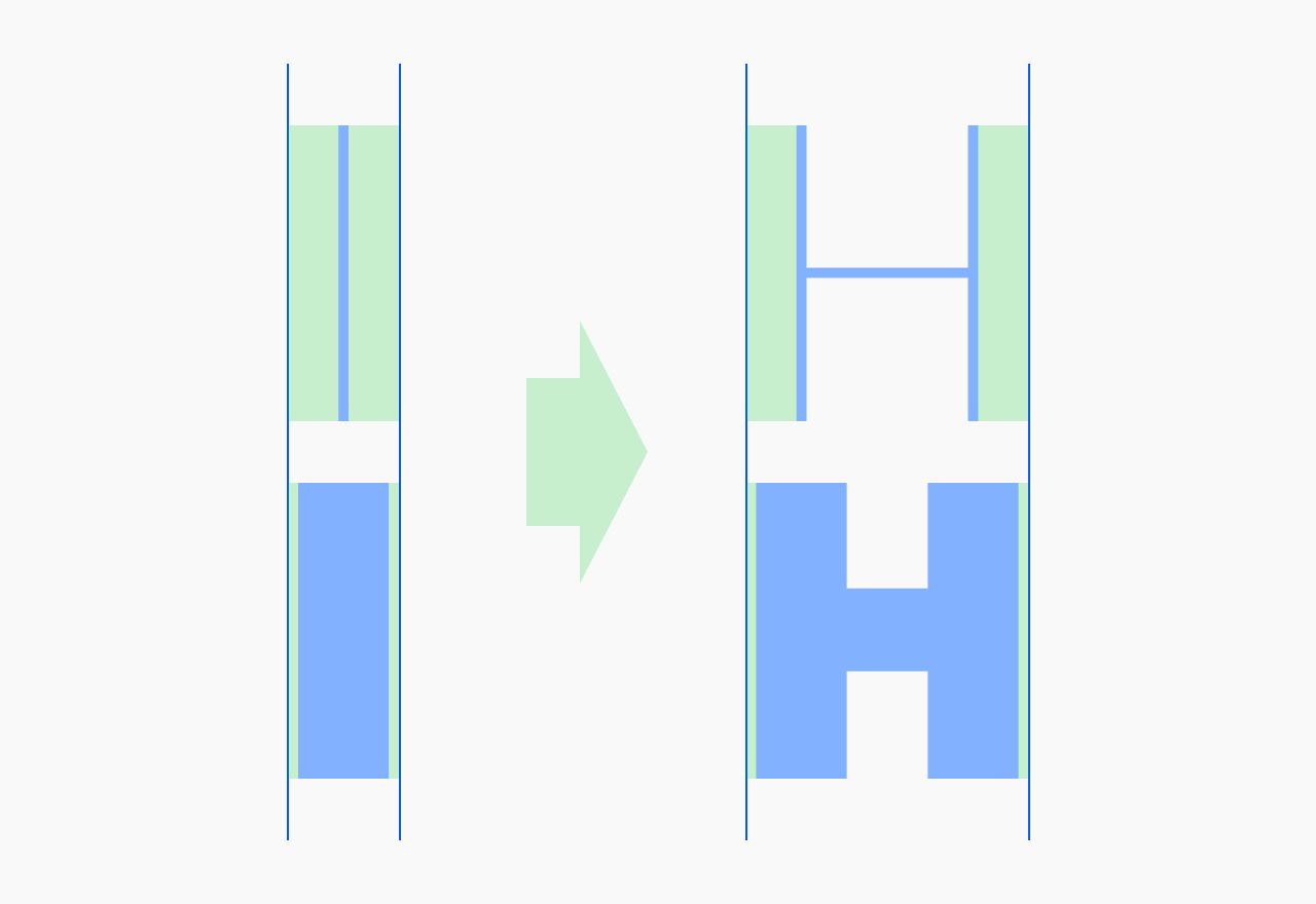
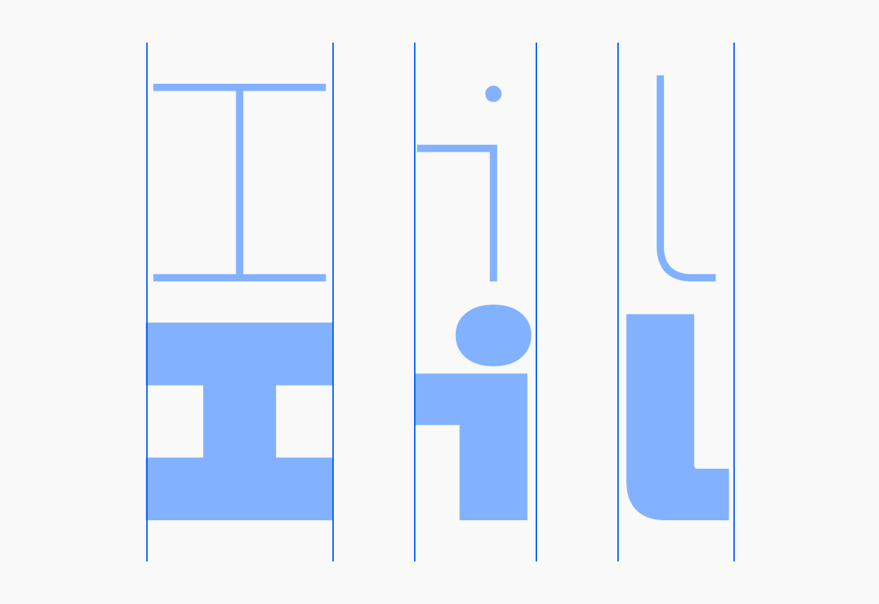
I started Unifora the same way I started Innovator Grotesk: I drew capital H and O as corner masters, then lowercase n and o. Those four set the font’s proportions and spacing. I managed to draw a few more glyphs before the turn came to I and i—and, surprisingly, the spacing I’d used for H and n didn’t work for them.
It might sound like nonsense, but look at H: it has space inside the glyph and space around it. You have two levers to make Thin and Black land on the same total width—the width of the letter itself, and the sidebearings. With I, there’s only one lever. The letter is just a stem, and the stem’s thickness is dictated by the weight, so the sidebearings are all you have. Same for i.
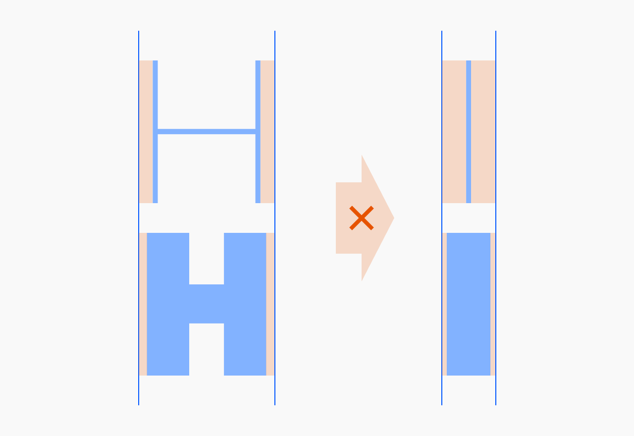
The dependency flipped: once I’d set the sidebearings for I and i, I had to redraw all the glyphs I’d mistakenly considered finished.
Some foundries solve this by adding four serifs to I, a single serif to the top of i, and a tail to l. I’ve seen a solution where I and i keep their plain design but carry uneven spacing compared to other straight-stemmed glyphs. The upside of both approaches is that they allow more traditional proportions across the weight range.
No solution comes without cons, so it was a tough call. In the end I leaned on the same lever as in the previous section: Unifora’s character. Since Unifora is, as I said, a straightforward font by nature, it should accept zero compromise in spacing or glyph design. Nudged proportions wouldn’t hurt—they’d add personality.
Kerning has to match across all masters
On Innovator Grotesk, I could kern upright and slanted pairs differently. For example, with a period between two capital O’s, the upright Thin master might be −40 on both sides, but −40/−80 in Thin Italic, because space is distributed unevenly in slanted shapes. In a proportional font, kerning helps fix a lot of these little problems.
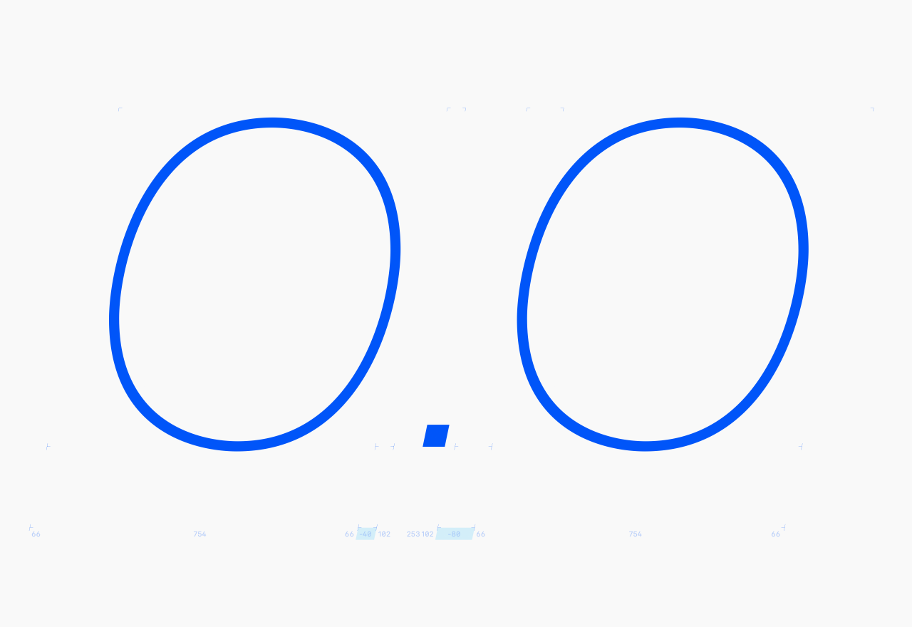
With uniwidth, the widths are locked, so the kerning has to follow. Set −40 between the period and O in Thin upright, and it has to be −40 in Black upright, Thin Italic, Black Retalic—every master (within one width, if your variable family has a wdth axis). Any per-master deviation breaks the width lock. And that leads to two side-effects.
Side-effect #1: fix spacing with a glyph’s shape, not kerning
When you slant diagonal glyphs like A, V, and Y, the spacing around them—which was perfect upright—becomes uneven. The clearest example is a period between two V’s: upright, it looks balanced; slanted without adjustment, the period looks shifted to the right.
On Innovator Grotesk I’d have fixed this with kerning. But since per-master kerning isn’t an option in a uniwidth font, I had to redistribute the space inside V’s em box instead. I shifted the V shape to the right and then, to keep the sidebearings intact, adjusted its top corners—cutting the top-left one and extending the top-right one. So the corner cuts in Unifora aren’t decoration.
Side-effect #2: slanted masters need their own punctuation
Take uppercase H and slant it: both sides are full-height stems, so the spacing around it stays even. No problem. Now take O. Slant it, and the space turns uneven—tighter on the side it leans toward, looser on the other. The advance width didn’t change, but the balance around the letter did.
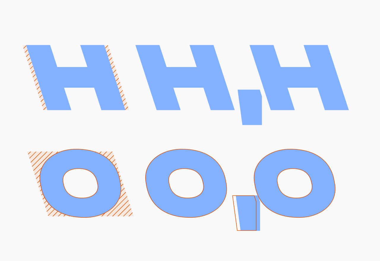
On its own, that’s a spacing annoyance. What makes it thorny is global kerning. You can’t nudge O–comma in the slanted masters and leave the uprights alone.
The fix was a separate set of contextual alternates—comma, apostrophe, a few other marks—with shapes and spacing tuned for italics and retalics. OpenType code swaps them in based on what’s around them.
* * *
I remember sitting with that punctuation problem convinced it simply had no solution. Eventually I found one—and so Unifora exists. I’m grateful to Unifora: designing this family was a real challenge, and I learned a ton. Thank you, Unifora.
P. S. A shorter version of this article first appeared as a post on r/typography.